INVEST DIFFERENTLY
Highcrest Capital, Fredericksburg, Texas
How do you explain something nuanced in a simple way, to people are sophisticated, but don’t understand?
This is the question that plagues nearly every single alternative investing fund we’ve worked with. It is hard to articulate something that’s new and nuanced to sophisticated people. It’s hard to balance being very clear and also highly intelligent.
We jumped into Highcrest in its infancy and have had a profound impact on shaping a clear, concise message around this alternative private credit fund. This kind of lending is commonplace, but in the early 2010 era, it was novel, new, and felt “risky” to many investors. We sat in sales meetings and watched listeners glaze over and depart with the ever-present “We’ll think it over”. It wasn’t working and the fund was stuck at about $2m AUM.
As with every process, we start with curiosity-fueled listening. We spoke with investors, we created space for them to talk about what they value, what interests them, how they see the world, and what helps them develop enough trust to invest in something new. The answers were beautiful in their simplicity, and from them a narrative emerged around not having the time or wisdom to truly “Explore” investing. They sit and wait for opportunities to arrive, and there’s value in having someone “out there” looking for new ideas. Bingo, that’s what we were looking for. Other insights followed and “Invest Differently” became the battlecry for a more personal path to discovering new investments.
Now that we knew that the investment needed to be framed inside a brand that was all about “how you find interesting deals”, we could get to work on giving the message a place to live.
Our goal, visually, was to contrast the brand against dull financial language, taking a more simplistic approach and standing boldly in opposition to tradition. Red is often an avoided color in investing, it can signify decline or losses, but we chose to embrace the color, using it as a “flag” of challenge to the status quo. Mountain icons referenced this “explorer” mentality that pervaded the brand, a strong focus on thinking differently with new eyes toward undiscovered investing approaches. Highcrest truly was exploring and offering people, a completely new world of investing differently. When we handed the brand off to Highcrest, they were at $200m AUM and rising.
An Engaging Web Experience
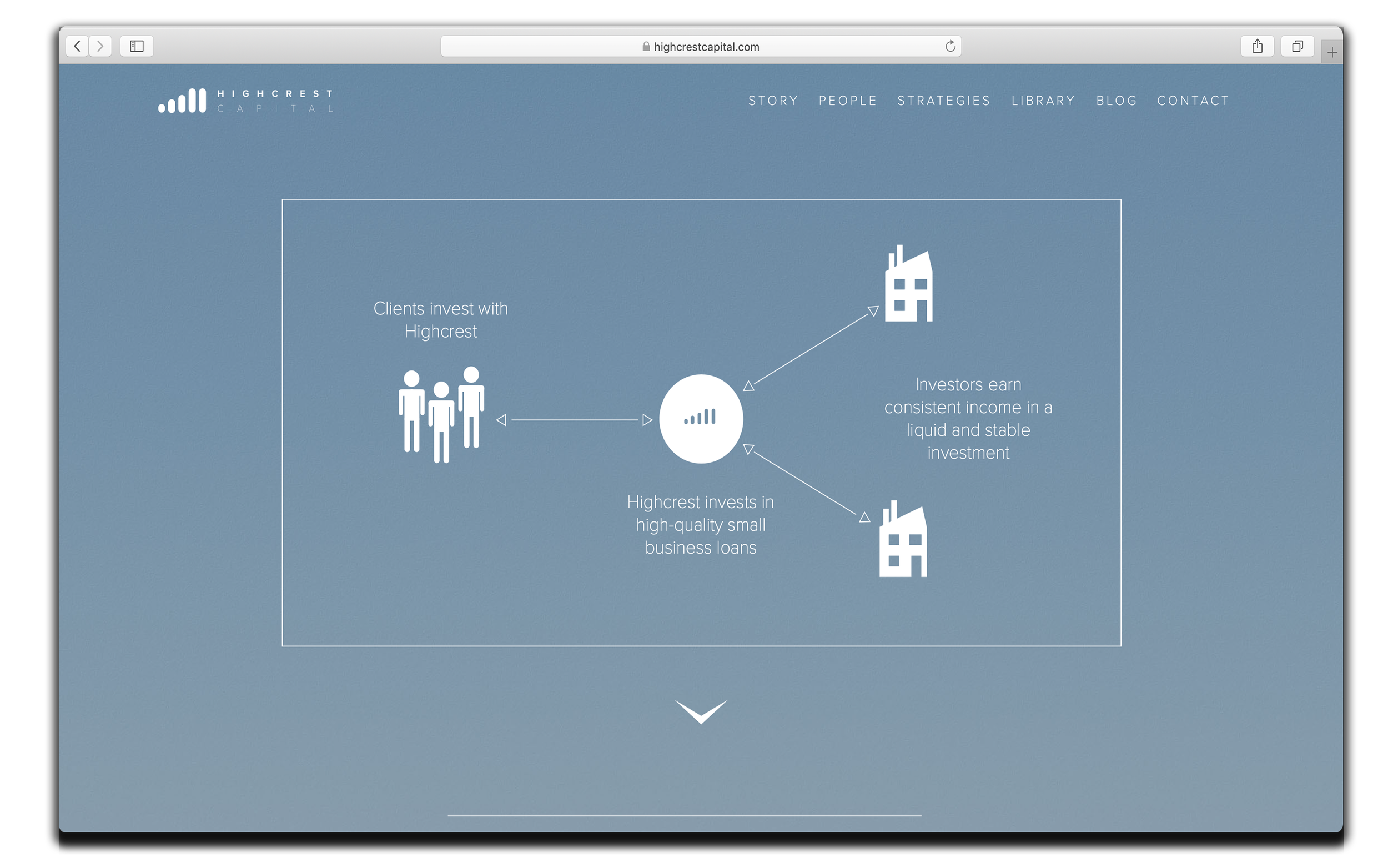
Every other investing company uses stock photography and city-scapes. We opted for personal, engaging video for our home page and interior images shot onsite in Scandinavia. Wild exploration is then contrasted with simple, graphical explanations of the investment offerings. Rather than using verbose financial language, the site is filled with conversational writing and simplicity. We locked in on actual, human faces as a means to begin building trust. When someone mentioned Highcrest to a friend or family member, when they typed it into Google, they were surprised and delighted by the creativity and humanity. No stuffed shirts here.
A See, Read & Touch Brand
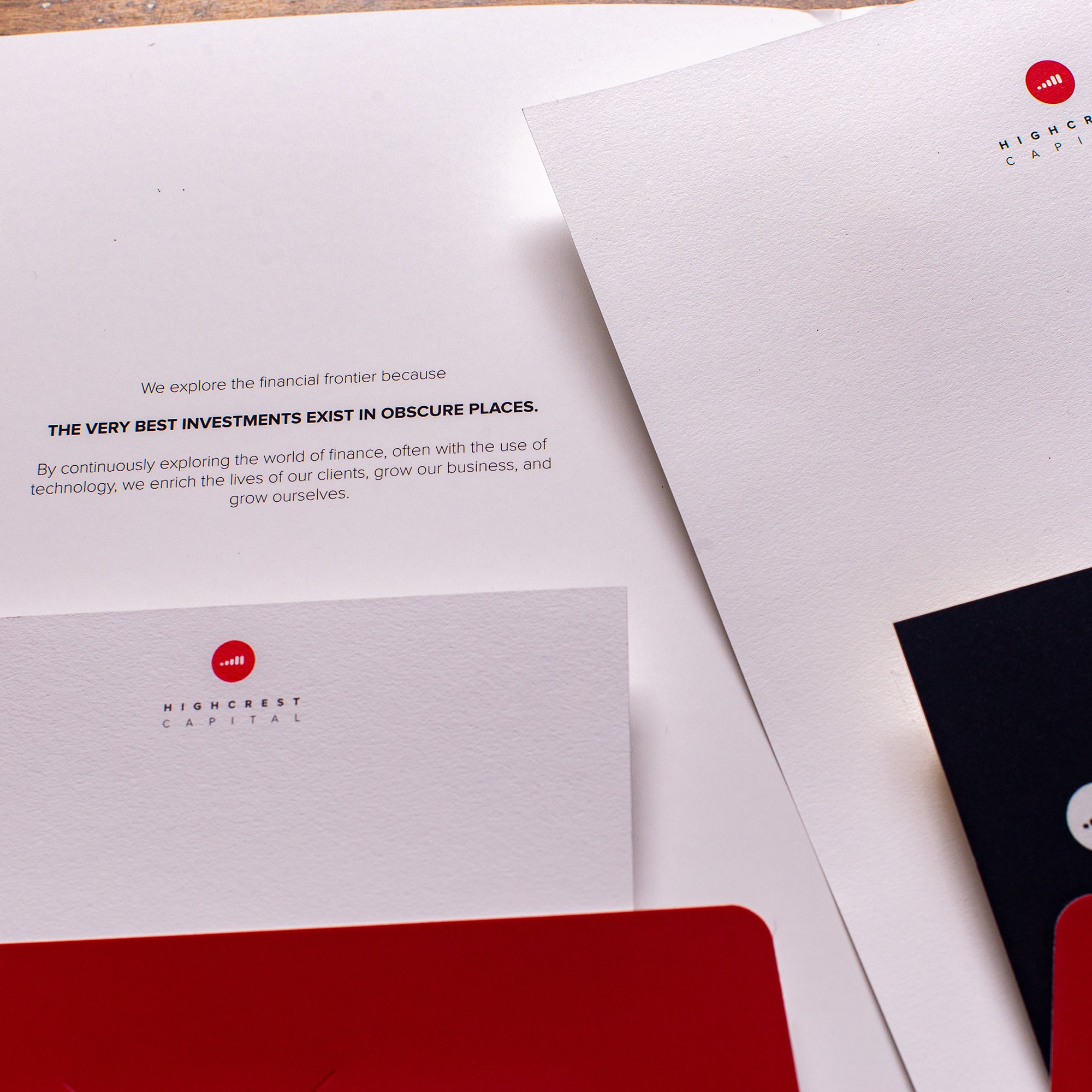
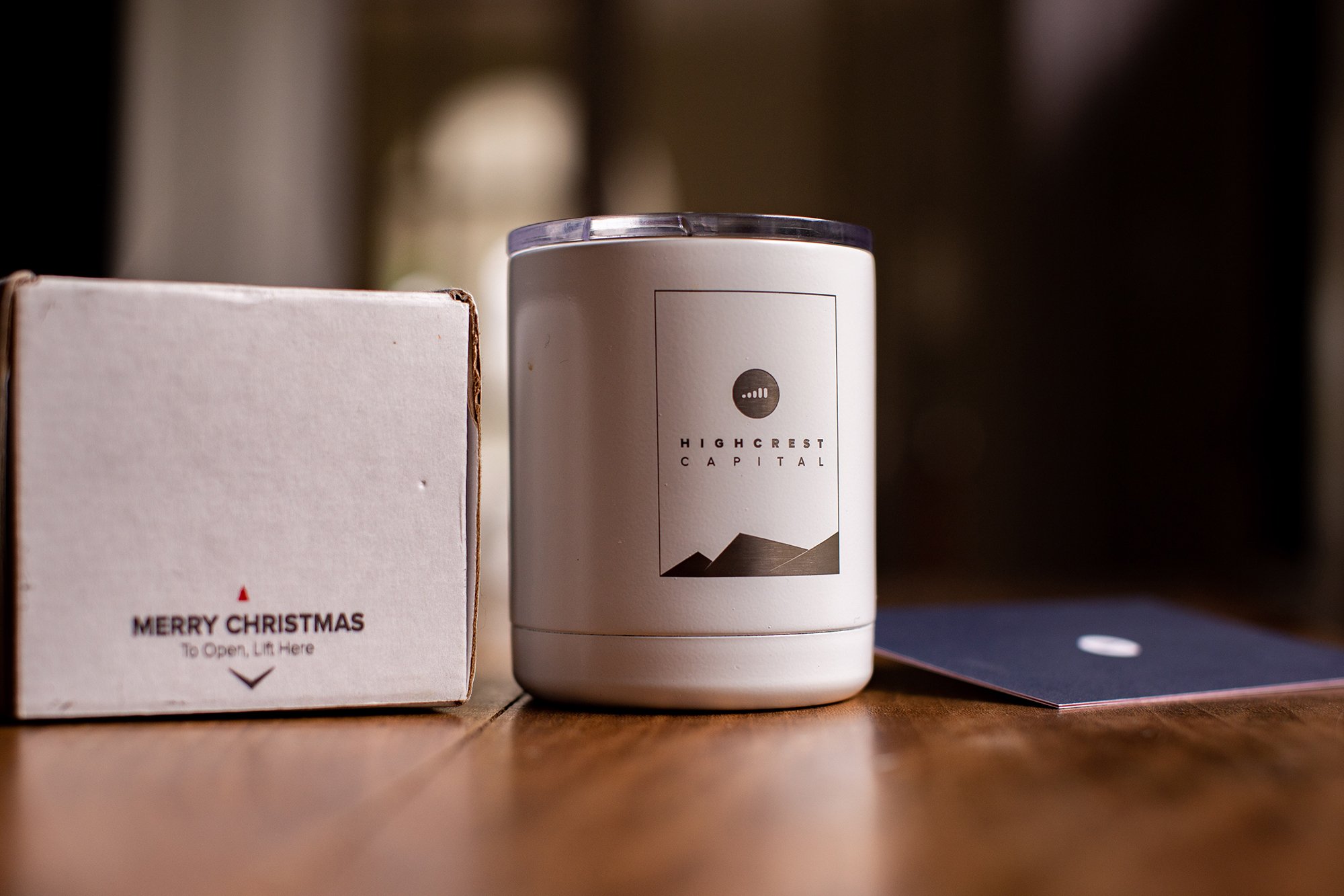
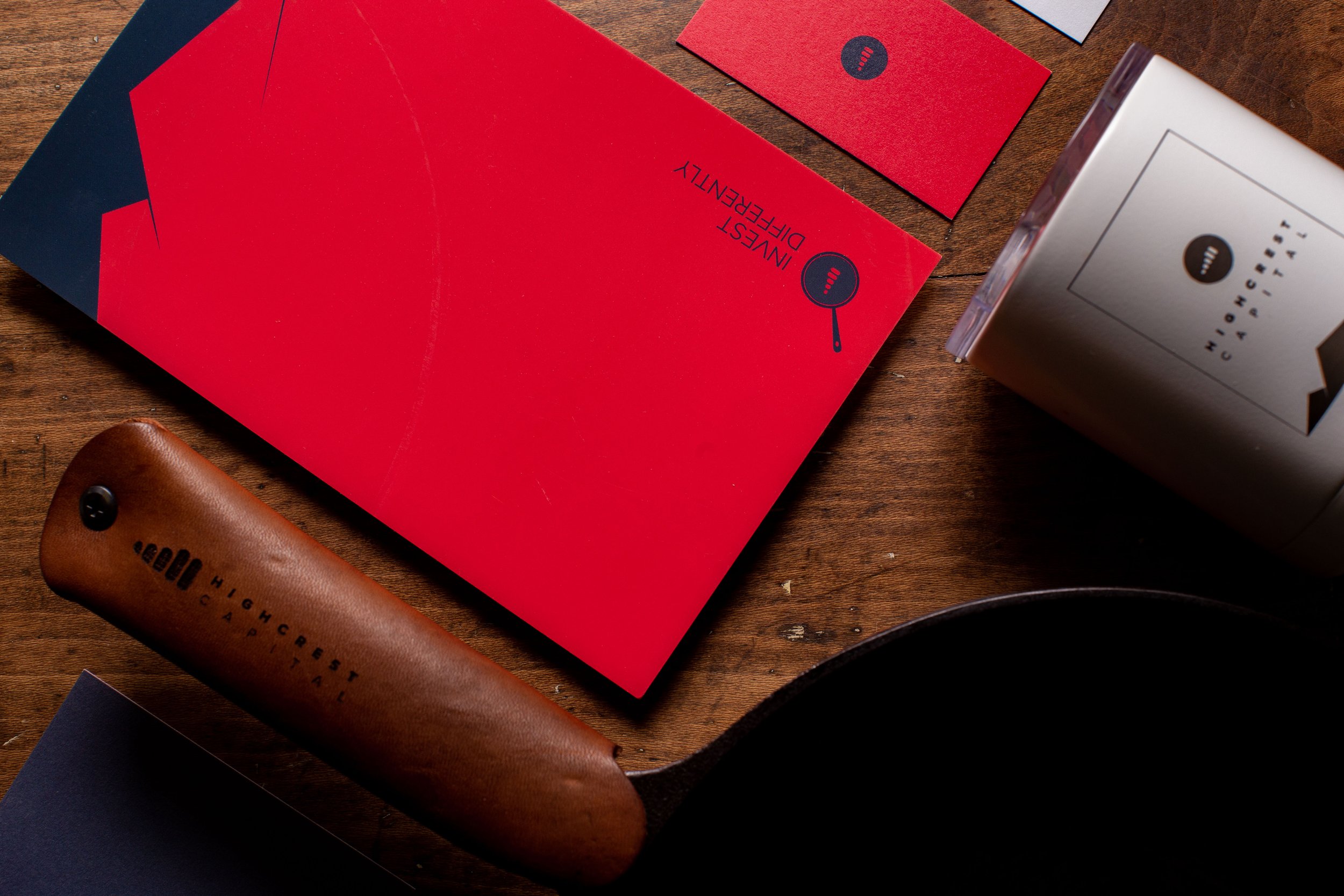
We live in a digital world, but tangibility creates trust. And so we wanted to make Highcrest “feel” real to people. We brought the bold colors out of the digital space and into the physical world. We designed items to stand off the desk and paired them with bold brand language to capture the imagination. From cups to cards, everything spoke to the exploratory nature of the brand through the use of subtle mountain range graphics and shouted “Invest Differently” at every turn. If anyone wondered about the legitimacy of the investment, they could get ahold of something “real” to calm their fears.
Relational Gift Giving
If we wanted to be a boutique investment firm, where everyone knew everyone by their first name, we had to walk the talk. Rather than sending stereotypical gifts to our clients every year, we custom-packaged highly unique items and then wove the story into the explanation. One year we gave every client a skillet from a company that represented the kinds of borrowers we were lending to. It brought the investment to life, to home, to reality. The money became tangible, the investment became real. People felt comfort in the transparency of the investment and began to deeply understand the investment itself.
UNIQUE TO ITS CORE
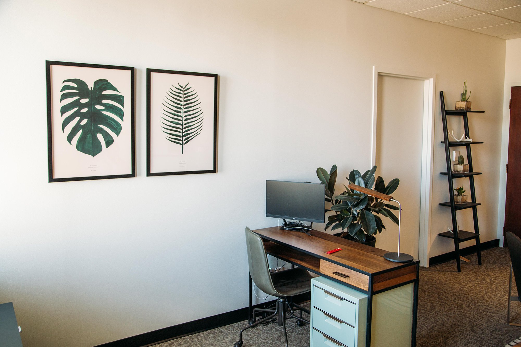
From the office to the personable staff, everything about Highcrest had to be approachable and un-intimidating. Capturing this ethos and cascading it through the brand experience was vital to making the company stand out. People felt welcomed, even if they never planned on setting foot on-location. And everywhere they turned, the messaging was consistent, from the visuals to the words: We are Explorers, We Invest Differently.
